Forests in Transition: Visualizing Global Deforestation
INFO 526 - Fall 2023 - Project 1
The Plotting Pandas - Megan, Shakir, Maria, Eshaan, Bharath
Our Dataset
“Global Deforestation” dataset from “Our World in Data”, tidytuesday.
Data looks at global deforestation trends and soybean production in Brazil.
Our Data:
forest dataset
soybean_use data
Our Dataset
Aim: Provide critical insights into the ever-evolving dynamics of global forests and the influence of soybean consumption, contributing to a better understanding of essential environmental conservation and sustainable land management practices.
Question 1
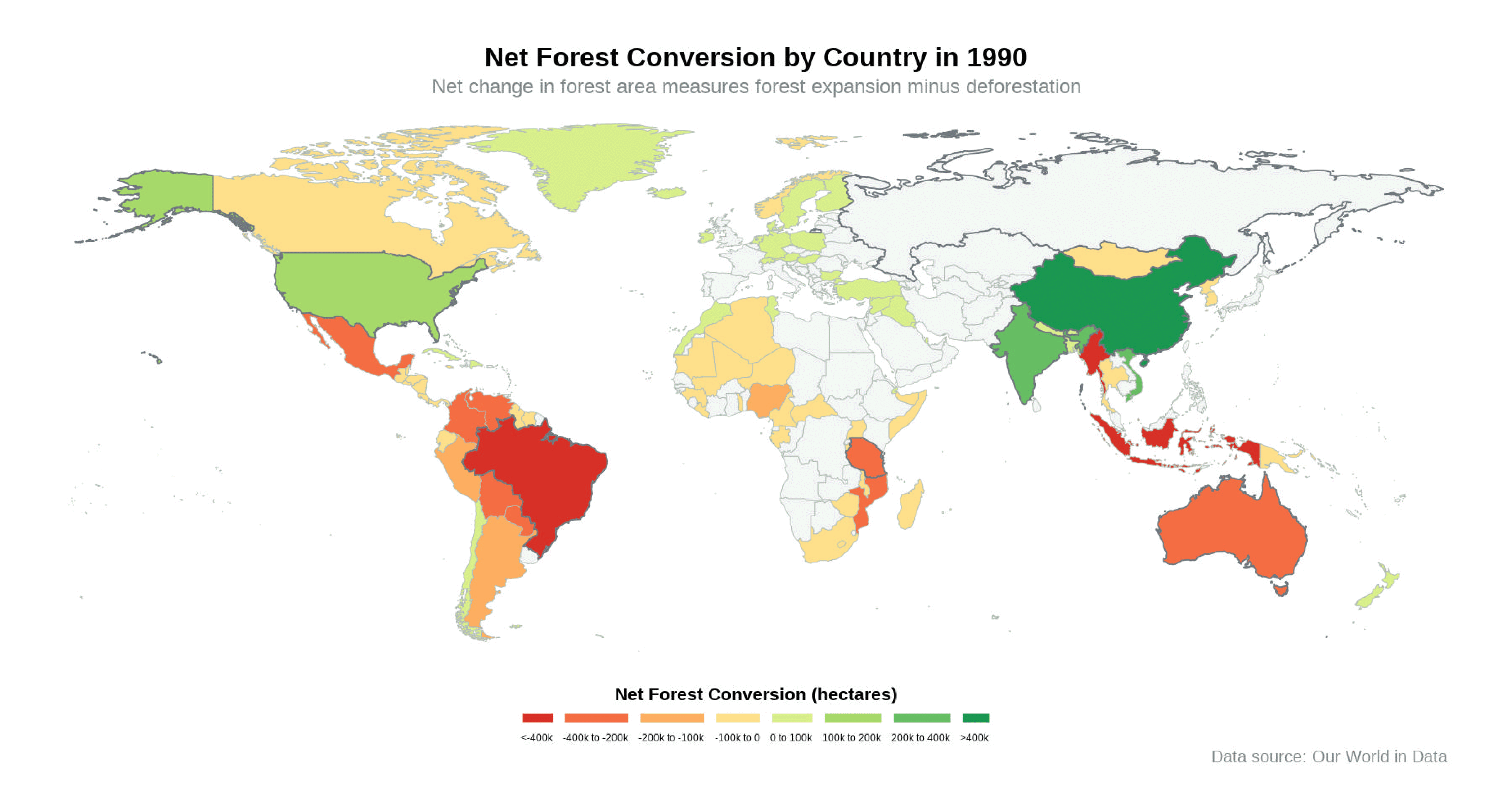
What does the global forest area look like over past decades?
The primary goal of this presentation is to demonstrate changes in forest cover from 1990 to 2015.
Decrease in forest cover over the past few decades.
While certain countries show an increase in forest cover, we are still losing our battle against deforestation.
International efforts, such as the United Nations REDD+ program, aim to reduce deforestation.
Approach
Getting geographical data from maps package
Roots of the approach
Pre-processing Function
# function to pre process the forest dataset# input : dataset - tibble# unique_countries - tibble# output : filtered_data - tibbleprocessForest <-function (dataset, unique_countries) { filtered_data <- dataset |># filtering only entity, year and net_forest_conversion columnsselect(entity, year, net_forest_conversion) |># getting all the countires which are not present in forest dataset for a specific years# bind_rows() is used combine combine rows of two data framesbind_rows(# anti_join() is used to return only the rows from the first dataset that isn't having matching rows in the second dataset based on specified key columnsanti_join(unique_countries, dataset, by =c("region"="entity")) |># adding year and net_forest_conversion for that specific year as NAmutate(year = dataset[1, "year"], net_forest_conversion =NA) ) |># renaming USA and UK so that both these countries are matching in world dataset and forest datasetmutate(entity =case_when( entity =="United States"~"USA", entity =="United Kingdom"~"UK",TRUE~ entity ) ) |># creating a categorical variable forest_converstion to group countries based on their forest conversionmutate(entity =coalesce(entity, region),forest_converstion =case_when( net_forest_conversion <-400000~"<-400k", net_forest_conversion <-200000~"-400k to -200k", net_forest_conversion <-100000~"-200k to -100k", net_forest_conversion <0~"-100k to 0", net_forest_conversion <100000~"0 to 100k", net_forest_conversion <200000~"100k to 200k", net_forest_conversion <400000~"200k to 400k",is.na(net_forest_conversion) ~NA_character_,TRUE~">400k" ) ) |># ordering forest_converstion column using factors based on the created categoriesmutate(forest_converstion =as_factor(forest_converstion) |>fct_relevel("<-400k","-400k to -200k","-200k to -100k","-100k to 0","0 to 100k","100k to 200k","200k to 400k",">400k" ) )return(filtered_data)}
Leveraging geom_map() from ggplot
Branches of the approach
Function used to generate the plot
# Function for creating the ggplot map plot# Using the filtered_forests$`2000` dataset created earlier as a data source# using entity as map_id for first layer# using forest_convestion as fill aesthetic and word as map for second layer# using highlight_filtered_data$`2000` as another dataset for creating another map layer# using entity as map_id,forest_convestion as fill aesthetic and highlight_world as map for third layer# input : year - integer# output : world_plot - plot objectgenerateForestConversionPlot <-function(year) { world_plot <-ggplot(filtered_forests[[as.character(year)]], aes(map_id = entity)) +geom_map(aes(fill = forest_converstion),map = world,color ="#B2BEB5",linewidth =0.25,linetype ="blank" ) +geom_map(data = highlight_filtered_data[[as.character(year)]],aes(map_id = entity, fill = forest_converstion),map = highlight_world,color ="#71797E",show.legend = F ) +expand_limits(x = world$long, y = world$lat) +scale_fill_manual(values = color_mapping, na.value ="#F2F3F4") +coord_fixed(ratio =1) +labs(title =paste("Net Forest Conversion by Country in", year),subtitle ="Net change in forest area measures forest expansion minus deforestation",caption ="Data source: Our World in Data",fill ="Net Forest Conversion (hectares)" ) +theme_void() +theme(legend.position ="bottom",legend.direction ="horizontal",plot.title =element_text(size =19, face ="bold", hjust =0.5),plot.subtitle =element_text(size =15, color ="azure4", hjust =0.5),plot.caption =element_text(size =12, color ="azure4", hjust =0.95) ) +guides(fill =guide_legend(nrow =1,direction ="horizontal",title.position ="top",title.hjust =0.5,label.position ="bottom",label.hjust =1,label.vjust =1,label.theme =element_text(lineheight =0.25, size =9),keywidth =1,keyheight =0.5 ) )return(world_plot)}
Creating an animation of the generated plots
Forest Conversion Analysis
Notable positive shifts occurred in the 2000s and 2010s in particular countries.
South America and Africa continues to bear the brunt of deforestation.
Challenges faced
Lack of geographical data in the dataset.
Handling NA data and countries with no data.
Getting the legend right!
Rendering issue due to too much ink being used on the plot.
Question 2
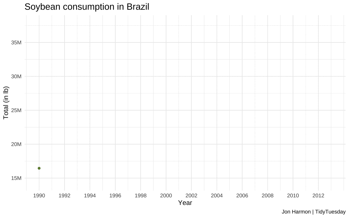
How has the consumption of Soybean in Brazil changed over time, and how does it impact the afforestation or deforestation rates?
Our central question revolves around the historical evolution of soybean consumption and its potential implications for afforestation and deforestation rates in this vital agricultural region.
Our visual representation of this data employs the versatility of ggplot, particularly using geom_line() and geom_point() methods to construct time series plots.
These plots provide a dynamic illustration of the trends in soybean production in Brazil, shedding light on the growth and fluctuations in this vital agricultural sector.
Approach
Pre-processing of soybean and forest data
#Function to pre-process the total_forest, soybean_use and forest_area datasets#Input : total_forest- tibble# soybean_use- tibble# forest_area- tibble#Output: soybean_brazil- tibble# forest_brazil- tibble#Cleaning total_forest tabletotal_forest_cleaned <-clean_names(total_forest)#Making a new column to calculate the total soybean consumptionsoybean <- soybean_use |>mutate(total = human_food + animal_feed + processed)#Some countries do not have consumption, and shows as 0. #Removing the rows if total=0soybean <-subset(soybean, total !=0)# Filter data for Brazilsoybean_brazil <- soybean |>filter(entity =="Brazil", year>=1990&year<=2013)# Filter data for Brazil forest: forest_brazil <- forest_area |>filter(entity =="Brazil",year>=1990&year<=2013)#Finding total forest coverage per yeartotal_forest_world <- total_forest_cleaned |>filter(year >=1990, year <=2013, entity =="World") |>group_by(year)# Left join to add total world forest coverage to the forest_brazil datasetforest_brazil <- forest_brazil |>left_join(total_forest_world, by ="year")#Finding actual total coverage for Brazil (percentage * total)forest_brazil <- forest_brazil|>mutate(forest_area_brazil = forest_area.x * forest_area.y /100)
Plotting of soybean consumption in Brazil
#Code for creating the time series plot#Used the soybean_brazil dataset created earlier as a data source#using year and total as x and y axis for first layer#Plotting points over line to increase visibility as second layer#Manual fill to show trend as positive#Input: year and total- numeric#Output: plot_soybean_brazil- plot object# Create a line plot for Brazil soybean consumptionplot_soybean_brazil <-ggplot(soybean_brazil, aes(x = year, y = total, color ="Brazil")) +geom_line(linewidth =2) +#Plotting line plot of seriesgeom_point(color ="#6E8B3D") +#Plotting points for claritylabs(x ="\nYear", y ="Total (in lb)\n", title ="Soybean consumption in Brazil\n", caption ="Jon Harmon | TidyTuesday") +theme_minimal() +theme(legend.position ="none", plot.title =element_text(size =15)) +scale_y_continuous(labels = scales::label_number(scale =1e-06, suffix ="M")) +#Cleaning long numbersscale_color_manual(values =c("Brazil"="#a6d96a")) +scale_x_continuous(limits =c(1990, 2013), breaks =seq(1990, 2013, by =2)) #Defining year range#Saving plot to location, and defining custom widthggsave(plot_soybean_brazil, filename ="images/q2/plot_soybean_brazil.jpg", height =8, width =15, unit ="in", dpi =120)
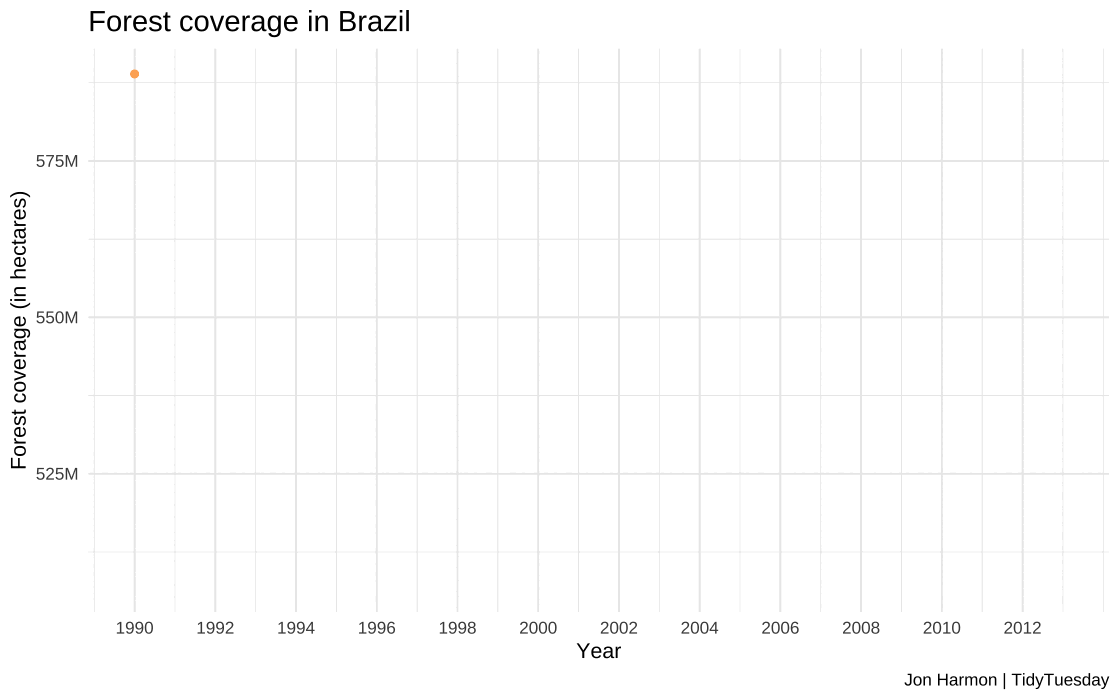
Plotting of forest coverage in Brazil
#Code for creating the time series plot#Used the forest_brazil dataset created earlier as a data source#using year and total as x and y axis for first layer for line plot#Plotting points over line to increase visibility as second layer#Manual fill to show trend as negative#Input: year and forest_area_brazil- numeric#Output: plot_soybean_brazil- plot object# Create a line plot for Brazil with pointsplot_forest_brazil <-ggplot(forest_brazil, aes(x = year, y = forest_area_brazil, color ="Brazil")) +geom_line(linewidth =2) +#Plotting line plot of seriesgeom_point(color="#fdae61") +#Plotting points for claritylabs(x ="\nYear", y ="Forest coverage (in hectares)\n", title ="Forest coverage in Brazil\n", caption="Jon Harmon | TidyTuesday") +theme_minimal() +theme(legend.position ="none", plot.title =element_text(size =15)) +scale_color_manual(values =c("Brazil"="#fee08b"))+scale_x_continuous(limits =c(1990, 2013), breaks =seq(1990, 2013, by =2))+#Defining year rangescale_y_continuous(labels = scales::label_number(scale =1e-6, suffix ="M")) #Cleaning long numbersggsave(plot_forest_brazil, filename ="images/q2/plot_forest_brazil.jpg", height =8, width =15, unit ="in", dpi =120)
Outcome
Animation of soybean usage
Outcome
Animation of forest coverage
Analysis
The visualizations provide a clear depiction of the steady increase in soybean consumption in Brazil.
The data shows a remarkable increase, from approximately 16.4 million pounds of soybeans in 1990 to a staggering 36.87 million pounds in 2013.
The forest coverage in Brazil dropped from 588 million hectares in 1990 to 507 million hectares in 2013, representing a significant loss of 81 million hectares of forest land during this time.
This reduction in forest area is indicative of the environmental impact in Brazil.
The correlation between rising soybean consumption and decreasing forest coverage in Brazil underscores the need for sustainable agricultural practices and conservation efforts.
Challenges faced
Lack of total forest coverage for the world.
Animation and frame rate selection.
Error in data type and rendering method selection of gif during animation.